Thousands of professional emails are sent per person each year. Each one is an opportunity to connect with prospects, current clients, and colleagues.
Through these digital interactions, email signatures have become a hybrid of traditional business card and banner advertisement. More than simply providing your contact information in an easy-to-locate place, a well-designed email signature can build recognition and trust.
An effective email signature is both functional and memorable. Here’s how to make both happen:
- Know what information to include…and what not to include
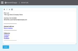
The most important pieces of information are your name, title, company, and business website. People like to see a signature that contains at least one phone number, but be careful about including your cell phone – emails do get forwarded around outside of your control so take into consideration how public you want that access channel to be. There is some controversy over if it’s best practice to include your email address within the contact information, as some see it as redundant while others prefer to see a complete list consistent with a traditional business card.
- Keep your text clean, plain, and simple

Learn more about customizing emails with MaverickApp.
Do your best to match your fonts and font colors to your company’s marketing materials for consistency. Use as few different fonts as possible – you can vary elements by altering the font through bolding, italicizing, or through size. Using too many fonts or colors can become distracting and make your information difficult to read. If you’re building from scratch without an existing brand identity to guide you, choose a font that is easy to read and professional and that works across platforms, such as Arial or Times New Roman. (Do NOT, I repeat, do NOT use Comic Sans or Papyrus.)
- Keep your graphic elements simple
When it comes to placing graphical elements, continue with that “less is more” mindset. Including too many graphics will clutter your signature. For best results, limit yourself to one or two images. Your company’s logo builds brand identity for your company and lends credibility to you personally. A well-lit professional headshot photo can do a lot for building familiarity and is appropriate/expected in several industries. Other industries, however, look down on it. Be careful with this one. You can choose to include accreditations if it will add to credibility, but be choosy about that as well in this application.
- Pay attention to alignment & hierarchy
The design principle that makes the difference between an organized, clean and effective signature versus one that looks hastily thrown together is hierarchy and alignment. Putting thought into aligning your fonts and graphics in a consistent and logical way reflects the order and organization you value as a professional. Most email signatures are left-aligned as it is found this is the easiest for the eye to read. You can lead your readers to what is most important through hierarchy – using font size, weight, and color to guide the eye through conscious design.
- Optimize for mobile
With 85% of readers using smartphones to access their emails, mobile optimization is very important, particularly when it comes to scaling of images. Mobile screens are much smaller than computer displays so make sure your fonts and graphics look good when scaled down. You may need to consider replacing your company’s logo with a simpler version or find more scalable graphics. For testing you can send yourself a test email to check on your mobile device.
- Use a call to action and/or social media icons
If you believe you’ve got room, your email signature can provide a clickable opportunity to lead your email readers to further interact with you and your brand. A common tactic is to include icons that link to your social media accounts. It’s appropriate for a professional signature to limit itself to professional platforms like LinkedIn – avoid irrelevant personal social accounts – and perhaps the company’s official channels. From a design standpoint, there are many customized versions of social icons out there that may blend more cohesively with your brand’s look. This is not your only option for outlinks, however – why not invite recipients to read your blog, meet you at an upcoming event, or anything else that invites them to build upon your relationship. Please do keep in mind, as we’ve mentioned multiple times so far, keep it simple and clean and do not overwhelm with too many requests and distractions.
- If necessary, disclaimers and legal requirements
In some industries such as the financial or legal sectors, legal disclaimers are commonly included beneath email signatures to establish confidentiality expectations or minimize liability, even to warn of potential viruses. Some countries have specific legal requirements that all business communications must meet. Your attorney should be familiar with the specific laws governing email signatures in your country.
There’s a good chance more people see your emails every day than see your face in person. Make your best impression with a good-looking email signature. Now that you’ve learned these guidelines, you can craft an effective signature that conveys professionalism while inviting your reader to further interact with you – ending every communication on a positive note.
